Welcome to pynimate
Pynimate is a python package for statistical data animations.
Installation
with pip
You can install pynimate using pip
Import
Pynimate is generally imported as nim and this convention is followed throughout the documentation.
Canvas
The Canvas class is used as a base for the animations, it handles the matplotlib figure, subplots as well as creating and saving animations.
Basic Animations
We will go through some basic data animations using pynimate.
Bar Chart Race
Create a Bar Chart Race using the Barhplot module.
Pandas is a dependency and used for data manipulation, your data have to be a pandas DataFrame.
The data needs to be in the following format,
where the time column is set to index.
Pandas setup
Use pandas to import your data and set the time column as index.
Here is a sample data that we will work with.
df = pd.DataFrame(
    {
        "time": ["1960-01-01", "1961-01-01", "1962-01-01"],
        "Afghanistan": [1, 2, 3],
        "Angola": [2, 3, 4],
        "Albania": [1, 2, 5],
        "USA": [5, 3, 4],
        "Argentina": [1, 4, 5],
    }
).set_index("time")
Datafiers
Datafiers or Data Modifiers are helper modules that handles the data preparation part.
The dafafier for Barhplot is BarDatafier
Barhplot
Barhplot can be initialized in two different ways
either by passing the BarDatafier
data: The data to be plotted and animated.
time_format: The date-time format of the data index. In our case it is "%Y-%m-%d".
ip_freq: The interpolation frequency. Most data in their original form are not suitable for animations, Why?
Lets understand the absolute basics of these animations. Consider this data:
So if we were to plot this, the video would be 3/24 second long.
This is where interpolation(Linear) comes to play, if we were to interpolate the data quarterly,
The new data will be
   time     col1  col2
2012-01-01  1.00  3.00
2012-04-01  1.25  2.75
2012-07-01  1.50  2.50
2012-10-01  1.75  2.25
2013-01-01  2.00  2.00
2013-04-01  2.25  1.75
2013-07-01  2.50  1.50
2013-10-01  2.75  1.25
2014-01-01  3.00  1.00
In general you will be plotting a much larger data, so your video will be much larger.
The interpolation is mostly used to make the video smooth.
You might wonder whether this interpolation will misrepresent the plot. Considering there is no way to know what the original values are between the actual intervals.
That is something for the user to decide. If your data is large enough, you wont need interpolation.
In such case set ip_freq = None.
Now that the fundamentals are discussed, use Barplot to create the animation.
# import matplotlib if you wish to see the animation in gui
import pandas as pd
from matplotlib import pyplot as plt
import pynimate as nim
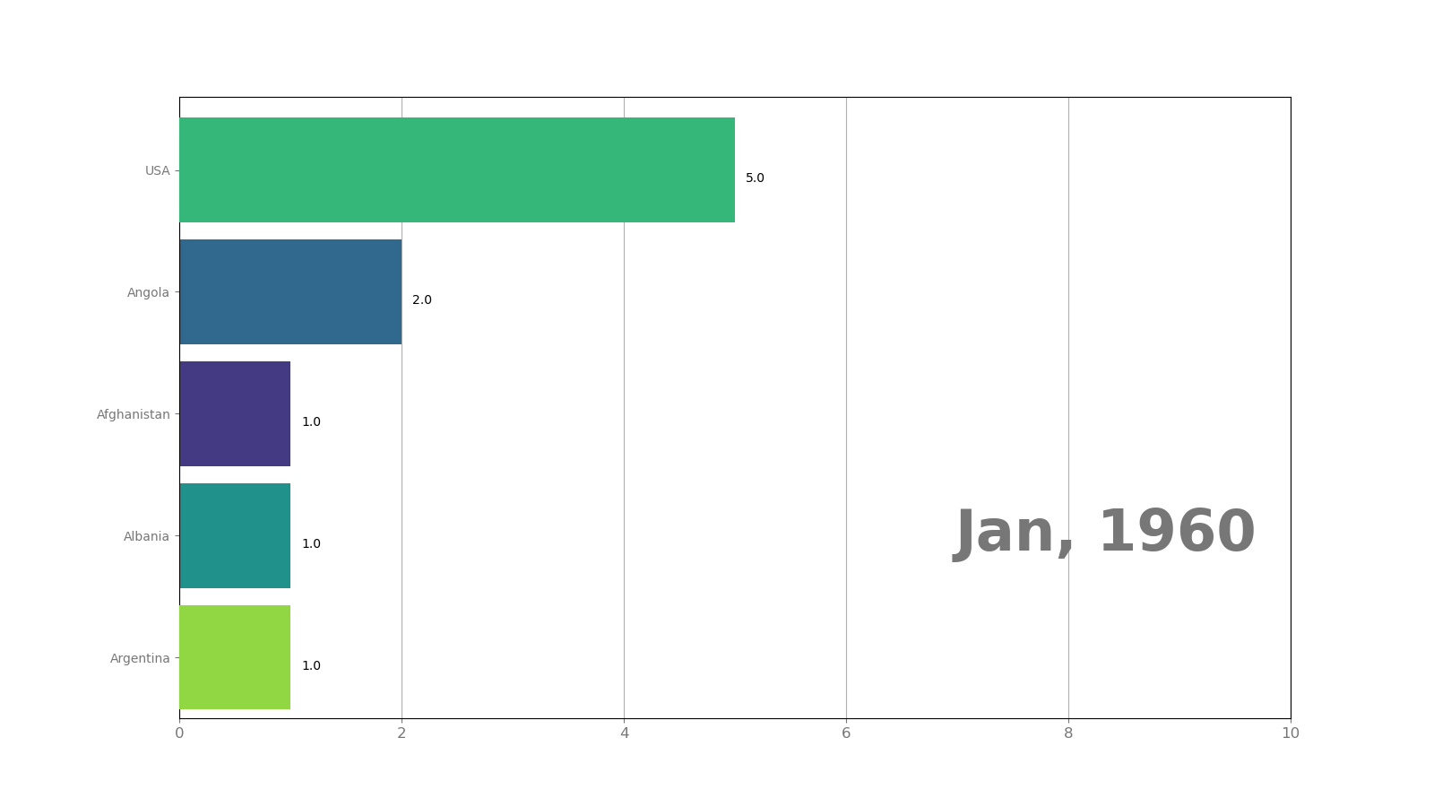
df = pd.DataFrame(
{
"time": ["1960-01-01", "1961-01-01", "1962-01-01"],
"Afghanistan": [1, 2, 3],
"Angola": [2, 3, 4],
"Albania": [1, 2, 5],
"USA": [5, 3, 4],
"Argentina": [1, 4, 5],
}
).set_index("time")
cnv = nim.Canvas()
# Interpolation frequency is 2 days
bar = nim.Barhplot.from_df(df, "%Y-%m-%d", "2d")
# use set_time to draw the datetime in the canvas
# here we are using a callback that returns datetime formatted in month, year
bar.set_time(callback=lambda i, datafier: datafier.data.index[i].strftime("%b, %Y"))
# add the bar plot to the canvas
cnv.add_plot(bar)
cnv.animate()
plt.show()
Save the animation
Use Canvas.save() to save the animation.
As GIF
Matplotlib uses pillow under the hood to save gifs, however you can use writer of your choice.
As mp4
ffmpeg is a standard writer for saving as mp4
Canvas.save() to save the animation
Result!