Creating a dark themed Animated Line plot
The data
We will be using Covid 19 data from kaggle by 'SRK and Devakumar K. P'. You can use the already cleaned data from examples/data/Covid_IN.
| date | cases | cured |
|---|---|---|
| 2020-03-28 | 185.0 | 13.0 |
| 2020-03-29 | 115.0 | 16.0 |
| 2020-03-30 | 181.0 | 6.0 |
| 2020-03-31 | 154.0 | 22.0 |
| 2020-04-01 | 475.0 | 20.0 |
| 2020-04-02 | 235.0 | 12.0 |
| 2020-04-03 | 401.0 | 10.0 |
Theming
Let us setup the colors for the lineplot. We will be using #001219 as the canvas color.
#Customizing matplotlib

import matplotlib as mpl
for side in ["left", "right", "top", "bottom"]:
    mpl.rcParams[f"axes.spines.{side}"] = False
mpl.rcParams["figure.facecolor"] = "#001219"
mpl.rcParams["axes.facecolor"] = "#001219"
mpl.rcParams["savefig.facecolor"] = "#001219"
post_update
post_update(self, i) is a function that runs for every frame. It is very useful for extending
the basic animation. In this example we will use post_update to format the xtick labels.
human_readable converts large numbers to human readable format.
def post(self, i):
    self.ax.yaxis.set_major_formatter(
        tick.FuncFormatter(lambda x, pos: human_readable(x))
    )
Customizing line styles
Use .set_column_linestyles() to set linestyles. We will set 'cases' to solid and 'cured' to dashed.
The final code
import os
import matplotlib as mpl
import matplotlib.pyplot as plt
import matplotlib.ticker as tick
import pandas as pd
import pynimate as nim
from pynimate.utils import human_readable
for side in ["left", "right", "top", "bottom"]:
mpl.rcParams[f"axes.spines.{side}"] = False
mpl.rcParams["figure.facecolor"] = "#001219"
mpl.rcParams["axes.facecolor"] = "#001219"
mpl.rcParams["savefig.facecolor"] = "#001219"
dir_path = os.path.dirname(os.path.realpath(__file__))
def post(self, i):
self.ax.yaxis.set_major_formatter(
tick.FuncFormatter(lambda x, pos: human_readable(x))
)
df = pd.read_csv(dir_path + "/data/covid_IN.csv").set_index("time")
cnv = nim.Canvas()
dfr = nim.LineDatafier(df, "%Y-%m-%d", "12h")
plot = nim.Lineplot(
dfr,
post_update=post,
palettes=["Set3"],
scatter_markers=False,
legend=True,
fixed_ylim=True,
grid=False,
)
plot.set_column_linestyles({"cured": "dashed"})
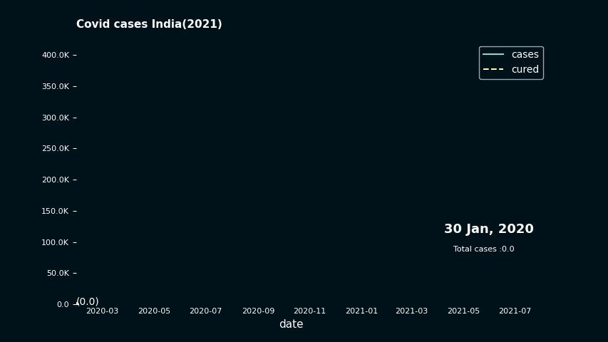
plot.set_title("Covid cases India(2021)", y=1.05, color="w", weight=600)
plot.set_xlabel("xlabel", color="w")
plot.set_time(
callback=lambda i, datafier: datafier.data.index[i].strftime("%d %b, %Y"),
color="w",
size=15,
)
plot.set_line_annots(lambda col, val: f"({human_readable(val)})", color="w")
plot.set_legend(labelcolor="w")
plot.set_text(
"sum",
callback=lambda i, datafier: f"Total cases :{human_readable(datafier.data.cases.iloc[:i+1].sum() )}",
size=10,
x=0.8,
y=0.20,
color="w",
)
plot.set_xticks(colors="w", length=0, labelsize=10)
plot.set_yticks(colors="w", labelsize=10)
cnv.add_plot(plot)
cnv.animate()
cnv.save("lineplot_dark", 24)
plt.show()
Result!